
Overview
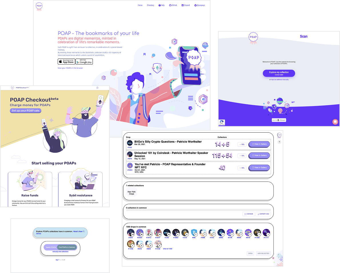
When I joined POAP, the company had grown rapidly, but its customer experience hadn't kept pace.
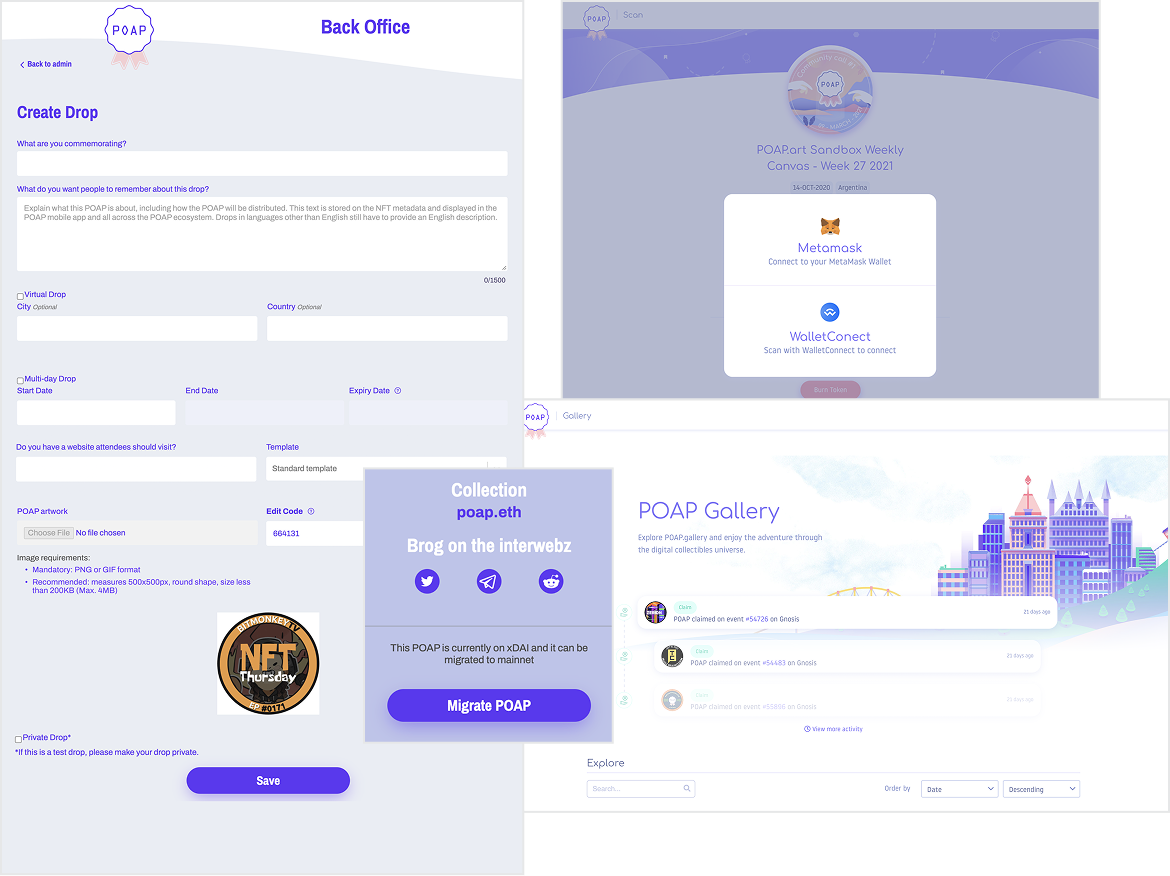
Each product had evolved independently. Interfaces looked unrelated, typography and color usage varied widely, and engineering teams maintained multiple disconnected Storybooks with little shared structure. Even the company's voice shifted dramatically between products—sometimes highly technical and verbose, other times casual to the point of undermining credibility.
For users, this inconsistency created more than visual friction. Because most products required connecting a cryptocurrency wallet, users were being asked to make an important trust decision. Without a recognizable, cohesive experience, many hesitated or abandoned the process entirely.
I proposed a company-wide initiative to unify the entire customer experience.
The Challenge
The problems extended far beyond UI.
- Multiple visual languages across products
- No centralized design system
- Inconsistent typography, colors, spacing, and components`
- Multiple disconnected Storybooks maintained independently by engineering
- No illustration or animation standards
- No copy guidelines or voice and tone documentation
- Fragmented navigation between products
- Low discoverability of newer products
- Wallet connection abandonment caused by low user confidence
- Increased customer support burden due to inconsistent UX
Rather than treating these as isolated design problems, I viewed them as symptoms of a larger organizational issue: the company lacked a shared design language.
 My Role
As Director of Product Design, I led the initiative from strategy through implementation.
- Auditing every customer-facing product and touchpoint
- Identifying patterns and inconsistencies across the ecosystem
- Establishing component standards
- Creating illustration and animation systems
- Writing the company's first voice and tone guide
- Establishing UX writing standards
- Partnering with engineering to unify Storybook architectures
- Introducing design tokens shared between Figma and production code
- Creating governance so the system could scale with the company
Building Trust Into the Experience
One insight became obvious during the audit:
connecting a crypto wallet is inherently stressful.
Blockchain transactions can be slow, and users often worry they're connecting to a fraudulent site. Instead of treating loading time as dead space, we redesigned the experience.
While blockchain transactions processed, users saw playful animations, reassuring messaging, and lighthearted copy that acknowledged the wait while reinforcing confidence that the process was progressing normally.
This transformed an anxious moment into a branded experience that felt intentional rather than broken.
Design System
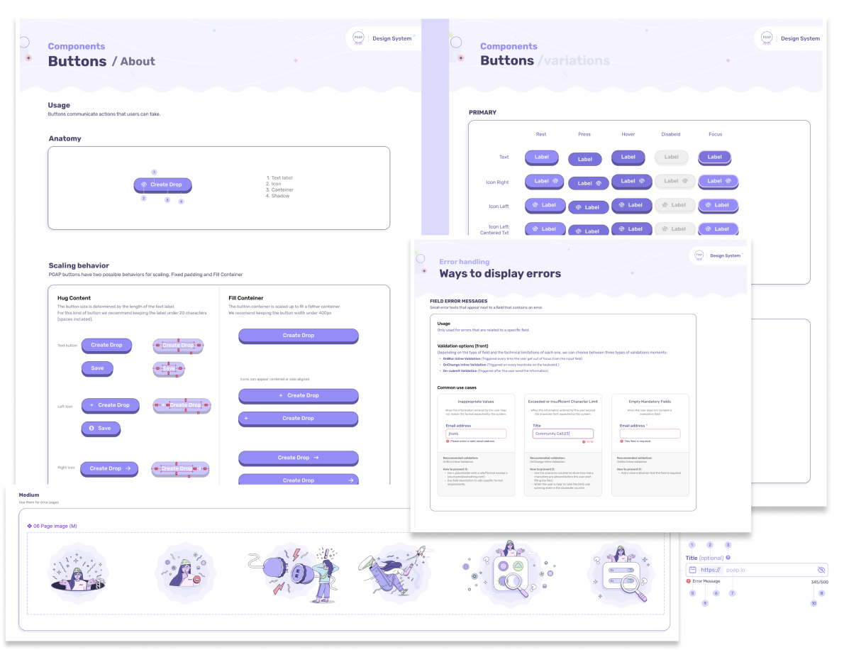
The design system became much more than a UI kit. It included:
- Design principles
- Color system
- Typography
- Components
- Grid and spacing
- Iconography
- Illustration language
- Motion guidelines
- Accessibility standards
- Voice and tone
- UX writing standards
- Content guidelines
- Navigation patterns
Working closely with engineering, we synchronized our naming conventions using design tokens so designers and developers spoke the same language.
For example, a component defined as "btn-md-primary" existed consistently in both Figma and the production codebase, dramatically reducing ambiguity and implementation errors.
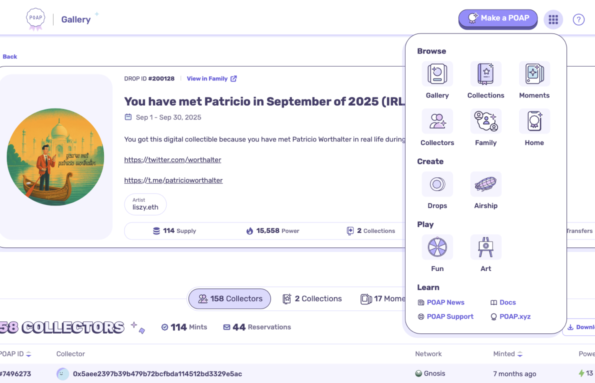
Unifying the Product Ecosystem
The audit revealed another opportunity. Many users only knew about a single POAP product because there was no easy way to discover the rest of the ecosystem.
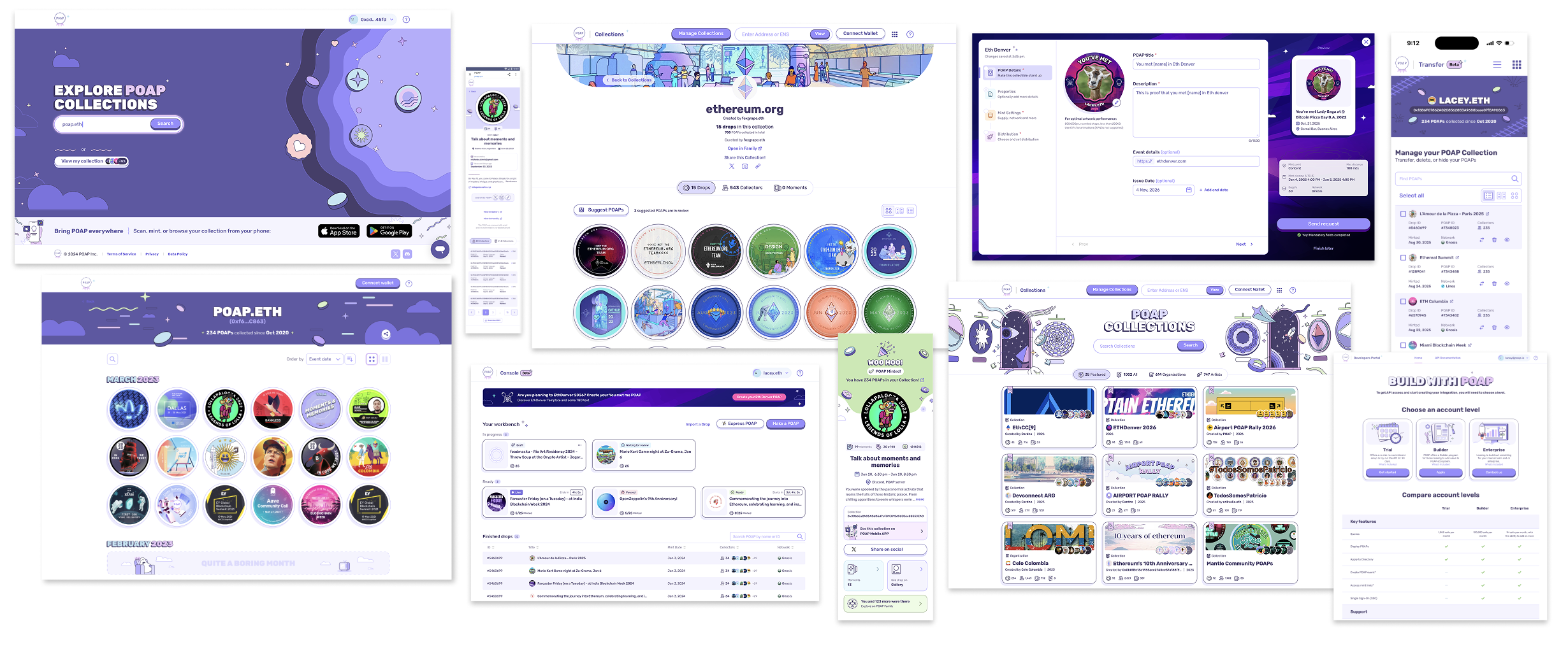
Inspired by navigation patterns used by companies like Google, we introduced a unified product launcher that surfaced every major product from anywhere within the experience.
Instead of isolated tools, the ecosystem began feeling like one connected platform.
This significantly increased visibility of lesser-known products and encouraged exploration across the platform.
 Results
User Impact
- Reduced wallet connection abandonment through stronger visual trust signals
- Improved confidence during blockchain interactions
- Increased discovery of products across the ecosystem
- Easier navigation
- Reduced user confusion
Business Impact
- Increased engagement across multiple products
- Reduced support requests related to navigation and usability
- Stronger and more recognizable brand identity
- More scalable foundation for future product launches
Team Impact
- Shared design language across design and engineering
- Unified Storybook architecture
- Design token implementation
- Faster implementation and handoff
- Improved consistency across every product release

Reflection
This project fundamentally changed how I think about design systems. A design system isn't a library of components.
It's a system of trust.
When customers recognize your products immediately, understand your voice, and experience consistency at every touchpoint, they spend less time questioning the interface and more time accomplishing their goals.